Navigate to Customize > Header > Navbar to access the navbar options.
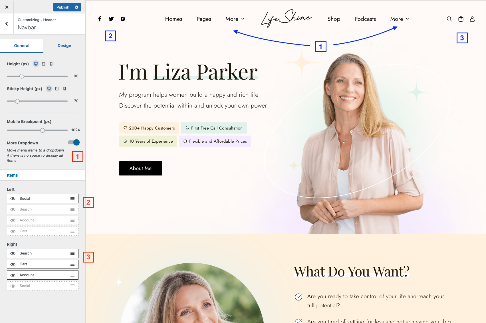
- Height – minimum navbar height
- Sticky Height – minimum sticky navbar height
- Mobile Breakpoint – screen width to trigger mobile navbar
- More Dropdown – Move menu items to “More” dropdown if there’s no space to display all items
- Items – click on the eye icon to show or hide a specific item and drag and drop the items to change the order.
Sticky Navbar
Navigate to Customize > Header > Sticky Navbar to access sticky navbar options.
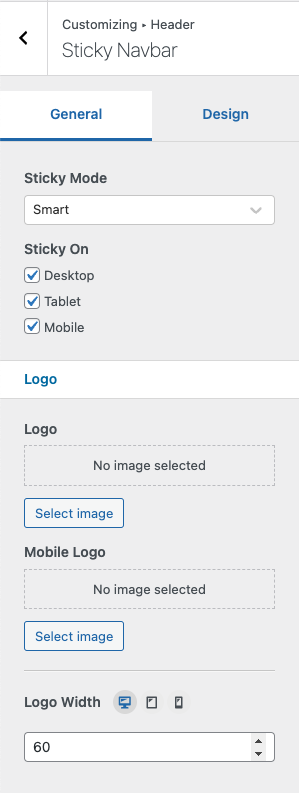
Sticky Mode
- Disable – Disable sticky navbar
- Always – Always stick to the top
- Smart – Hides the navbar while scrolling down the page and shows it scrolling up.
Sticky On
Sticky feature can be switched on/off separately based on screen width.
- Desktop – ( > 1024px )
- Tablet – ( 768px — 1024px )
- Mobile ( < 768px )
Logo & Mobile Logo
Logos set in this section are optional, default logo will be used if these options are unset. Sticky logo will only be displayed when sticky navbar is active.
Logo Width
Sticky logo width.